Thursday, April 26, 2012

10 Iconic furniture designs


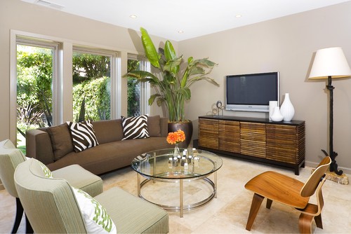
Continuing on from my previous post, I'm exploring some of the iconic furniture styles that were designed mid century and still are sought for  contemporary decor. Here are 10 of my favourites.

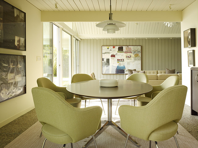
Eero Saarinen Womb Chair

Lake District Residence

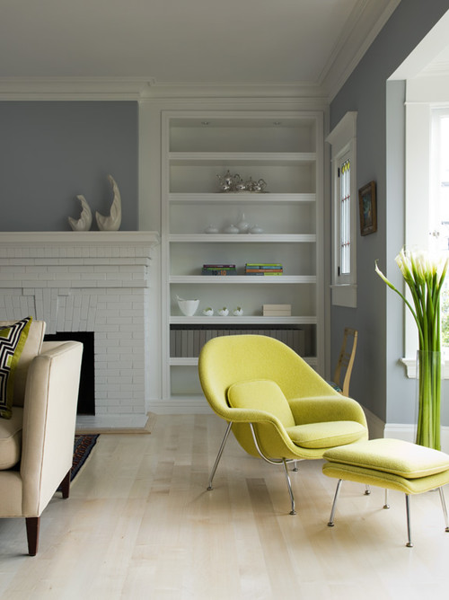
 The beautiful Womb Chair, designed by Eero Saarinen for  Florence Knoll in 1948, is  available in many vivid colours. This green is perfect with the pale floors and gray walls. 


The Eames Molded Plywood Chair

Amoroso Design modern living room
 Amoroso Design

Time  Magazine called The Eames Molded Plywood Chair "the best design of the 20th century" and it continues to be a staple into the 21 century. It was designed by Charles and Ray Eames in 1946 for Herman Miller. 

Arne Jacobsen Series 7 Chair 

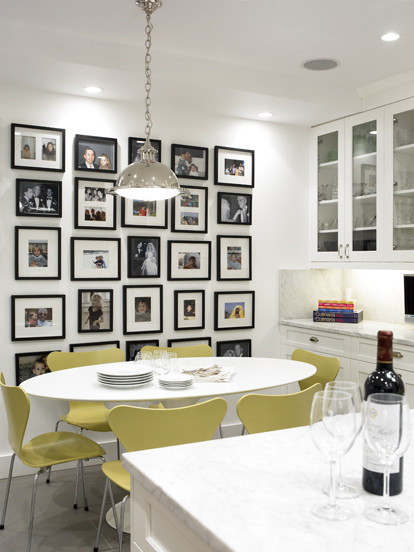
|| C O B U R N - A R C H I T E C T U R E || contemporary dining room

 Arne Jacobsen designed this chair in  1955. The curves  move your eyes in a restful rhythm and there is such softness to the overall look. I love the colour of these  particular chairs and the shape has always appealed to me.

Arne Jacobsen Egg Chair

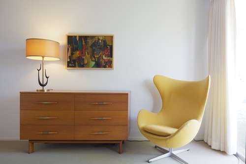
Vintage Furniture modern bedroom

Arne Jacobsen designed the egg chair in 1958 for the Radisson Royal Hotel. I visited Prague this past summer and this was the style of chair in one of the lounges.  They are super comfortable.

 George Nelson  Platform Bench 
 
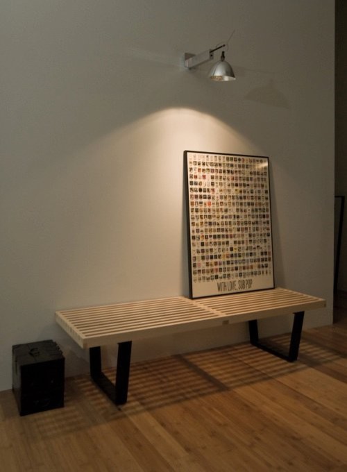
pearl district loft - entry modern entry

The  George Nelson Platform Bench manufactured by Herman Miller

You see the George Nelson Platform Bench quite frequently in trade magazines .  It is very versatile and works equally well as a coffee table or a bench.  Place it in a hallway, at the end of your bed, in an entrance where space is at a premium.  or in a living room. 

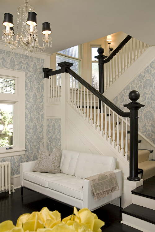
                                                      Florence Knoll  Lounge Settee

European Salon traditional entry
 Lucy Interior Design

This beautiful,  white Florence Knoll  Lounge Settee fits perfectly in this tiny space. The straight lines, tubted back and seat provide all t he detail that is needed to see why this is a  highly popular design in the 21 century.   


Isamu Noguchi Coffee Table 
 
source

  Isamu Noguchi tables are widely available and relatively affordable. They were in constant production from 1947 until 1973, and then returned to production in 1984, and  are still available.  Because of its rounded triangular shape it works well with one edge parallel to a sofa and the the other two edges facing two chairs on angles.  I have also seen it used to great effect with a sectional sofa and a chair arrangement. 

Wegner Wishbone Chair

Design Public, Dwell Studio

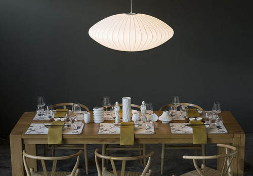
Have you ever seen The Wishbone Chair in anyone's home?  It is i probably the most popular Hans J. Wegner chair because its rounded style fits with so many other different styles of  furniture. .  This  designer  began his career as a cabinetmaker and then spent time as a furniture designer with  Arne Jacobsen's architectural practice. The Nelson Pendant light is another iconic mid century design. 

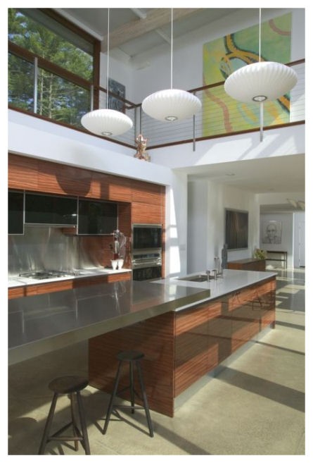
Nelson Bubble Light 
Kitchen design contemporary kitchen
Urban Homes

The first Nelson Bubble Light was designed by George Nelson in 1947.  They are hanging shades comprised of sculptural wire skeletons covered in translucent plastic. There are a variety of forms including: the Propeller, the Cigar, the Crisscross, the Ball, the Saucer, the Apple, the Pear, and the Lantern which are still in production today.

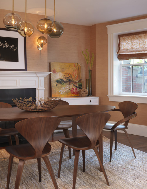
.Cherner Armchair  Side Chair

Dining Room modern dining room
Rachel Reider Interiors

Norman  Cherner designed this beautifully curved chair in 1958 and it went out of production in the 70'd. His sons started producing them again in 1999. 


Do you have a favourite?
 

Sunday, April 22, 2012

Make mine MCM

  I'm a baby boomer who  loves a sleek, open and slightly boxy look and  hates "do dads".  I was chatting with a  friend the other day and  praised  the mid century modern  (MCM)  period in home decor and was met with a quizzical look.  "Ah", I thought a good topic for a blog post.

Just as the name implies, this style  spanned a period of roughly thirty years  in the middle of the 20th century, from the mid-1940s to 1970. This fresh aesthetic developed  after  the Second World War when there was a desire to  recast earlier design to be more in keeping with  the bold new world that was expected. 

  HGTV 

Mid century modern  took from the simplicity of Scandinavian design and gained inspiration from the earlier Bauhaus style in Germany. During that period of time architects like Frank Lloyd Wright were designing  using organic, natural shapes  and bringing a whole new aesthetic to design.  This was also the era of mass production of furniture and accessories which made them more accessible to the average family.

The elements of MCM I like best are the  pared-down forms, contemporary patterns and  natural materials. 
I like to pick and  choose aspects from this design era and mix them with contemporary pieces. The 50's space age look - metal and mesh chairs,  sunburst clocks, bubble lamps and pole tension lights- is not to my personal taste, but I love to see it paired in someone else's decor. 

If you want to reference a mid century modern look in your decor consider the following: 


 Choose round and sleek


Saarinen Executive Chairs, a Florence Knoll table and a PH Pendant create the ultimate mid-century dining area.   The MCM  look is  about spaciousness and light. Think lots of windows, minimal walls,  clean and sparse styling with eye-catching elements.   The rounded lines and monochromatic colour scheme here produces a very calming look. I particularly like the tone of green which is similar to the wall colour in the room below.  Versions of George Nelson's bubble fixtures are still found in today's decor.

 Margaret Ryall

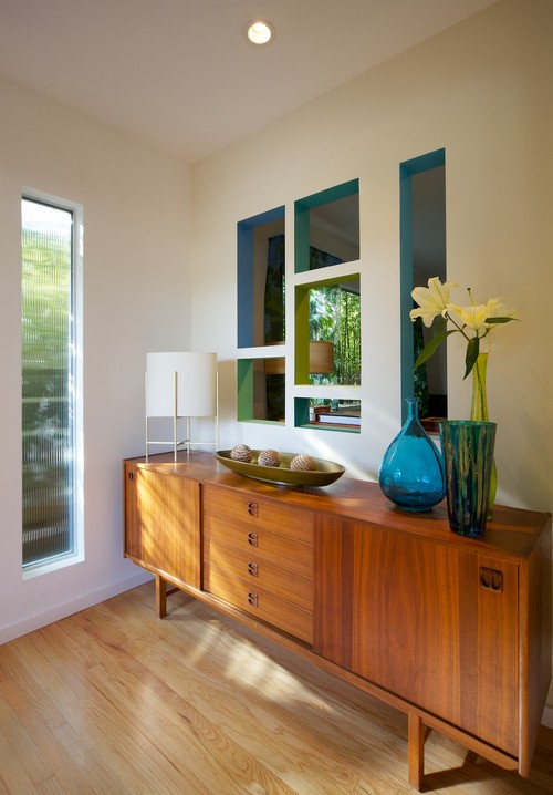
 Even mid century styled  rectangular furniture often had slightly  rounded edges as seen in this  hand crafted dining room furniture.  

 Explore Medium Toned Wooden Furniture

Mid-century style entry modern entry
Niche Interiors: San Francisco Interior Design Services modern living room
Niche Interiors

  As this era was about embracing nature, lighter  woods such as teak, oak and fir made their way into living rooms. 

Use  mid century modern  materials 

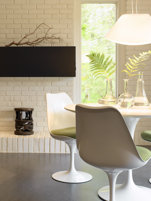
While the use of wood was a prominent feature of mid century modern decor, man made materials were just as prominent. Plastic including Bakelite on table tops, along with Plexiglass and Lucite, were all the rage.Other common materials wer  molded plywood and  wire mesh.   A good example of  how plastic was molded and is still popular today is  the tulip chair by Saaranin.

Kitchen table modern kitchen


Use bold textures and colours 
Living Room modern living room

There are so many mid century modern designs that are still popular today that I'll need another post to do them justice. Stay tuned. 


Wednesday, April 11, 2012

Furniture Facelift

It's unbelievable how a coat of paint and new hardware can turn an old piece of furniture into a hot new addition to your home.  Much to my husband's dismay I am not someone who  becomes faint at the thought of painting solid wood.  The way I look at it, furniture may have served you faithfully for years, and it deserves a facelife as it ages!  Besides, painted furniture is all the rage these days.  So get out those colour chips and find a dresser or table to bring to life.

Pops of colour in furniture play the same role as pillows or area rugs in your decor.  It's a great way to move colour around a room or to create a stunning focal point.

Check out these pieces and more on my Pinterest board


Turquoise/aqua is a very popular colour for painted furniture.  It is a very "usable" colour because it would fit in with most colour schemes as a lovely accent.

Corals and oranges are very popular for  a pop of colour.  Of course oranges are all the rage in 2012.


Royal purple is one of my favourites.  Buying new hardward of cleaning the original adds drama to a piece.


Don't save your bright colours for furniture.  A current trend is to have a coloured island.  This is a daring choice. 


Stenciling is an added embellishment for painted furniture.   I particularly like the matt/gloss look of this black  dresser. It would work in any decor.  Just do your stenciling with gloss varathane.


The blog Censational Girl  has great examples of painted furniture as you can see from the gems below. The colour choices allow the pieces to fit into any decor as a beautiful soft accent.


I love this  soft greens which would have a place in many decors.

 This beautiful lavender gray stripe is so simple, soft and utterly appealing with white furniture. 

Detailing adds to the overall look of a piece and this one has it in spaces. 


There's lots of painted furniture in both my homes. Everything in my summer house except for the kitchen table is a colour.  That's because every piece of furniture is second hand.  What better way to feel free to paint it up!


This is a  table left over from the era of the fully draped  table .  It is fun and funky in my summer house. 

The wicker chair in my kitchen was spray painted and the cabinet was built to store phonebooks, mail etc. The colours blend in and warm up the BM Rockport Gray walls.  The cabinet is BM Lennox Tan my favourite warm goldenish beige .


 My solid oak coffee and end table took on a whole new life when I painted them BM Kendall Charcoal.


I hope you have something that is calling out for a coat of paint!

Thursday, April 5, 2012

White, black and ...

YELLOW!

The colour of energy, sunshine and brightness.

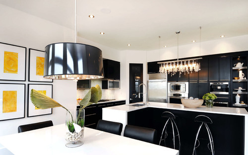
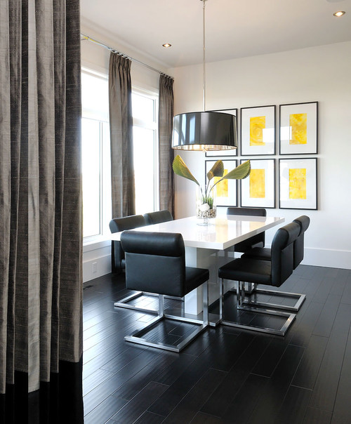
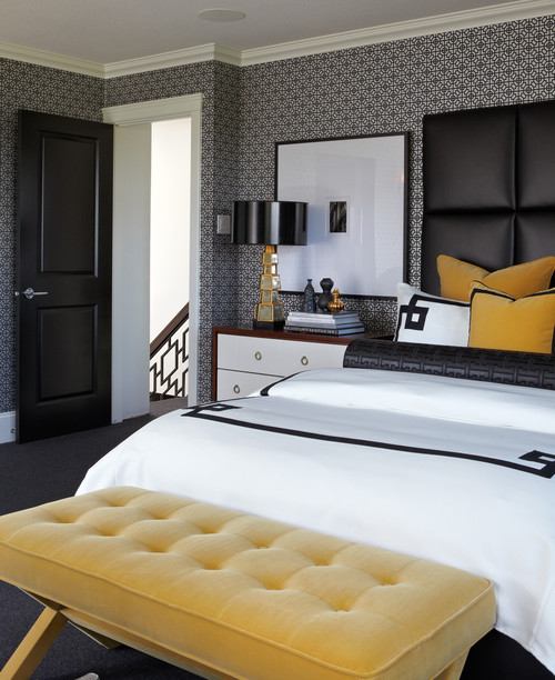
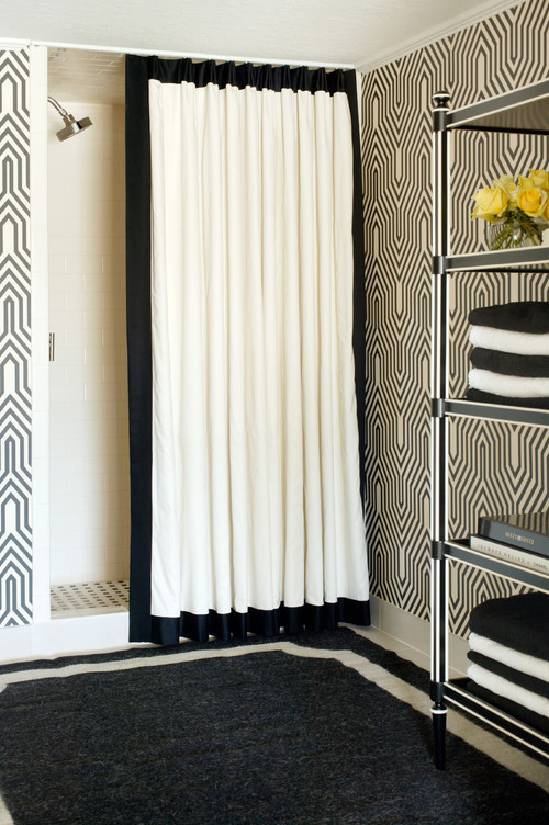
It's difficult to ignore the high contrast colour scheme of white, black,  and primary yellow.    My personal preference is to have mostly white with hints of black and yellow, but the scheme plays out in different ways. You can tell from the images I've selected that it is a very contemporary look and not one you see often  in traditional decor.  A quieter look would be created if you substituted the black for gray- my all time favourite combination.  You can have a little or a lot of yellow through accessories. I've stayed away from the obvious choice of painting walls yellow which seems to be just too much yellow  for my taste.  Perhaps you disagree.
 How do you like yellow in......

Dining areas

Willowgrove Kitchen contemporary kitchen

 Willowgrove Kitchen contemporary kitchen
Only yellow art work makes this room vibrate.
 Bedrooms....

Mallin Cres - Master Bedroom contemporary bedroom
 Atmosphere Interior Design Inc
.
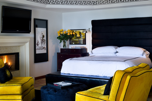
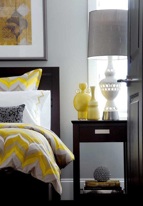
This yellow is more toned but still effective with white and black.

Malibu Mediterranean mediterranean bedroom
Hollywood Regency Style Detail eclectic bedroom
 Madison Modern Home

Mallin Cres - Guest Bedroom contemporary bedroom
Atmosphere Interior Design Inc
.
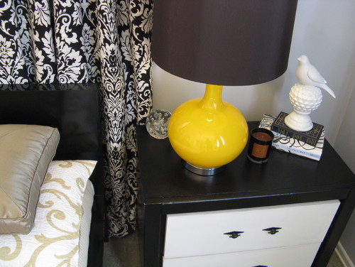
Finding the right accessories finishes a space.  Imagine the tables in the two rooms above  without the hit of yellow. 
 

Glitzy-Glam meets Farmhouse-Chic contemporary bedroom
Martha O'Hara Interiors

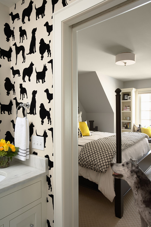
Only yellow pillows in the bedroom and yellow flowers in the bathroom but it's enough to lift the spirits of these two rooms.
 Living Rooms

Loft Living modern living room
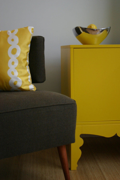
 Painted furniture brightens every room but you can't get any better than a yellow hue.

 source 

Yellow is a very commanding colour for chairs.  You certainly won't be ignoring this one.I love the way your eye moves from the chair to the art work and then to the accent pillows.  Perfect colour scatter.

Bathrooms 


Decor Pad 

One bright yellow chair speaks volumes and it's waterproof!


2010 Decorator Showcase modern bathroom
t De Meza + Architecture

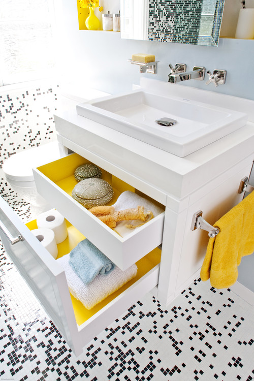
White and black small mosaic tile with splashes of bright yellow to enhance it.  Lining the drawers with yellow is an extra surprise . 

Indian Grove Bathroom eclectic bathroom
 Palmerston Design Consultants

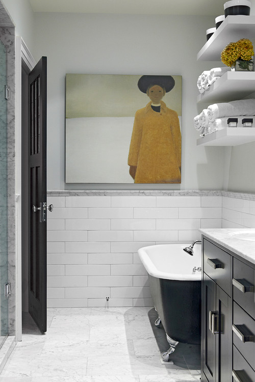
Imagine this room without the commanding art work.
 

Glenwood Residence eclectic bathroom
 Tobi Fairley


Porches 
Sometimes one perfectly placed accent makes a room sing.  


Art as Pop traditional entry
Blue Tangerine Art

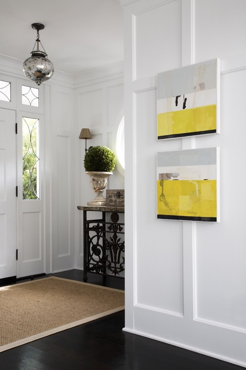
Don't forget the power of art to move a space from boring to exciting. This is one of my favourite images to show how art can lift any space to something special. 

Did you find inspiration in any of these rooms?  If you don't like yellow you could substitute yellow green, magenta, coral or turquoise.