Thursday, November 29, 2012

A must have vase

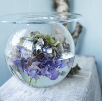
I'm in love with the Boblen  vase my new  neighbour gave me. Although we do not know each other well, she could not have chosen a more fitting gift.  I always have some version of fresh greenery or flowers in my home. The more I look at  this little gem the more ideas I get  for using it. 

The Boblen line of vases, designed by famous Norwegian Florist and TV personality Finn Schjoll,


 are expressive mouth blown vases  in clear glass in various sizes


 and colours. 


 Its design was inspired by water drops on a lily after the rain. The extended flat lip makes them especially conducive to wide floral designs....


 or to highlight  a single blossom.


 You can also put several vases of varying sizes together to create drama. 


 or float a flower in water in the bowl .


 source

  or wrap a creeping vine under and around the lip.


 You could also fill the bowl with candy, small glass ornaments, beach glass, berries, small blossoms, pepples etc.  and place a pillar candle on top.  An all around accent for your home that can always be on display.

Art Glass Vista  ships world wide.

Saturday, November 24, 2012

10 simple accent trees for Christmas


.  There is definitely a "simpler Christmas" trend in the last several years. Simple is good and clean and when you add green to the mix you have the perfect Christmas accent, a small/miniature tree.  From plain to layered, there are lots of options.

 A little woodland whimsy with wooden beads.

 Grouped with a sign 

 Welcoming visitors, no need for ornaments

 A "tree" constructed from branches of boxwood, but easily done with any type of greenery. I would cut oasis in a cone shape and go from there.  For all I know you can get oasis in a cone shape!

 A  shaped rosemary tree with wood accents.

 Rosemary again with starfish for a beach Christmas.


A lovely tree with pinecones in a recycled wooden box.  Nice candlestick holders too. The black and white accents provide a great backdrop.

Love the bucket and bench  (it's all the texture and gray) but the simple ornaments finish everything off beautifully.  Who would think white card trees could be so elegant?

Did you make these 3 D hearts as a child?  They bring back happy  memories for me. With all the great paper designs available the sky is the limit for this idea.


 And finally a little colour for those who want it.

All links can be found on my Pinterest page.

Friday, November 23, 2012

The value of objects

Every home is filled with furniture and objects, but they are not valued equally by homeowners. Personal preferences and history play a part in determining individual likes and dislikes in furniture and accessories.  Coming to terms with what you truly value in your home can help you set a design focus.

 As a place to start with clients who  may be  having difficulty focusing on where they want to go with a design, I often ask them to show me several things in the space that they value/love/ couldn't part with. In talking about why they like the particular piece I get insight into what is important to them and many times the objects also provide inspiration for the design.


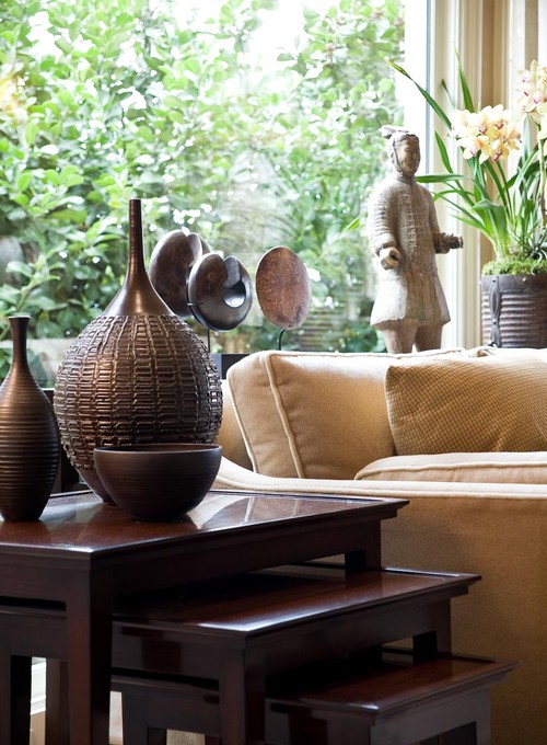
 Art work of varying kinds can serve  as an impetus for a room design.  The tones of the sculptures and ceramic vases  are picked up in the dark woods of the stacked tables. The beige sofa allows the art work to stand out. 

  Margaret Ryall

In my  home art usually influences my room designs.  I certainly don't purchase art work to match my decor, but I like to give my art work the option of influencing the room in which it lives!  One of my favourite pieces (artist Will Gill) begged me to paint this favourite chair a lovely green.

 Antique rugs are a wonderful starting point for original colour schemes.  This blue and aqua scheme is fresh and exciting, and without a wonderful starting point this room probably would not have come together in this way.  Mixing old and new can be easy if you are a little adventurous. 

Pet peeve:   Please, can I have a larger coffee table so I can reach it to put my coffee cup down when I come for a visit? It's the armless chair that I would sit in.  I hate floating coffee tables that don't connect with the furniture. Sorry, that just popped out.


Sometimes something as small as a pillow or a set of lamps can be the beginning of a sophisticated design.  Certainly if you owned these lamps they would be difficult to ignore.  Perhaps there is an interesting history  behind them. 


Not everthing you value is pretty.  Some objects  have  histories told by the marks of the passage of time. They evoke  family memories and offer opportunities for pairing with objects that have a similar history. I love this old box with its related sea themed objects.

 Margaret Ryall

This humble trunk my father made when I was a child is an important part of the decor in my summer house.  It isn't in pristine shape with a latch missing and and a crack around the hinge on the back.  To me it is invaluable.  Not only does it hold  memories, I have a coffee table and a storage chest.  I can change the colour anytime I want, and it gives my room that lived in look you want in a summer place. It is also a perfect foot stool!

For a room to truly reflect its owners it has to have objects that have some emotional value.  Otherwise you have a "model home", pretty but soulless

Monday, November 19, 2012

Celebrate ordinary things

 It is not necessary to spend huge amounts of money to accessorize your home.  Much of what you need is probably in another room or in the natural environment. Garage sales, thrift stores etc. can  also provide  economical options.  The trick is to select  things that have multiple uses.  In this way you can rotate objects to make them new.   I love bottles and natural elements together.  It's no wonder I loved Anna Truelsen's My Lovely Things blog when I found it this week. She is a pro at using ordinary things for big impact. 

 Take one white table and add various bottles and natural elements.  When you add a growing bulb to the mix the vignette will change as the bulb grows.

 The look is changed completely when a black frame is used as a backdrop and a potted plant and a narrow necked bottle is added with a chair in the foreground.

 Different bottles with feathery ferns change the look again.  I was thinking how I would love to add a small black and white print inside the frame to fill up the space at the top. What do you think?

Replacing the black frame with a mirror adds to the repetition of objects and the mirror will also reflect other things in the decor.  Massing object together has big impact.

With Christmas just around the corner what could you do to add a little festive flavour? 

 This  vignette and the one below are so simple,  inviting and in keeping with the other elements in the home.   


 Repetition of glass and natural elements with a few sparkles.  Very inviting. 


And now for something more dramatic!


Who knew that one sculptural green leaf could be so dramatic? 


This vignette is built on varying shades and finishes of black with a strongly sculptural branch with blossoms to break up the starkness of the space. You could achieve a similar look with any colour interior by keeping the colour of the objects in the same family.  Certainly black has an impact that other colours might not have.

Look around.  What do you have in your home that you could group together?


Friday, November 16, 2012

Embrace space

 I had a refreshing conversation with a client/friend recently about  reordering  and supplementing her space to make it more peaceful and inviting. It brought me back to  what  I  feel is important, and what I am  most attracted to in my own  living space.  My last post explores ways to create a peaceful environment and this one is a follow up.

I want a quiet, peaceful space and I'm constantly fighting my attraction to objects.  I love pattern, texture, shapes and a bit of glitz. After several years of letting myself buy this because.... or that because...., I have areas of my house that are getting just too object driven.  I'm currently in a simplifying phase and I have three guiding principles: 
  1.  Embrace space by decluttering
  2. Celebrate ordinary things
  3. Focus on what you value
Today's focus is....

Embrace space by decluttering 


 Getting rid of all the excesses in a house leaves a space that is simpler and opened up.   I feel you need to walk that fine line between  owning objects and feeling burdened by them. When you remove things you let empty space occupy the site, and your eyes will seek that openness.

  Do you want a table laden with an array of objects or do you want several meaningful objects? 

 For some people this is the ultimate in a layered vignette on a table top. In my own home, I would find this amount of "stuff" aggravating because my eye has no place to rest. Removing all but several meaningful  objects would create a calmer space. 


My eye is happier moving over this arrangement which has visual interest with its varying textures, shapes and heights, but still feels calm.

 Or this white on white arrangement  with wood tones to break it up.


For a more dramatic look you can have darker or more intense colour, but still have a pared down, clean  look.

 If you love art  it is always a challenge to have just enough to appreciate what you have. Each art piece needs its own personal space just like people.  Cluttered gallery walls are not for  everyone. Less is often more.

Here are several space enhancing tricks with art:

1960′s artwork by Al Held above a Louis XIV gilded settee
photography Roger Davies, Western Interiors April ’09

 Arranging one piece of art over furniture and viewing it from a distance creates a  long view.  Your eye moves over the space that is in front of it in a seeking fashion.  Honing in so to speak. It's very effective.  You need larger or dramatic work for this trick to be effective. Framing with a doorway is a great way to move your eye through.


Use repetition of simple frames and black and white on a coloured wall to anchor work and attract the eye. While there are four works here you view them as a unit.

 
 Source unknown

 Let art work take centre stage.  This room doesn't need any other art with these three panels.


 Create a supporting vignette under art but don't overdo it.  All of the elements of this vignette work together to support the art.  You could remove the books and pillows  for a more pared down look. It depends on how "hard' or "soft" you want your look to be.

Do you like to create more visual space in your home?  How do you achieve it?