Monday, January 28, 2013

So you want to hire a decorator


Many people think that working with a decorator is out of their reach financially  or that the results of the pairing would create a space that wasn't personal.  Neither of these beliefs are true if  homeowners  matche their  needs with the right decorator's skill set
 
Professional decorators usually hold a set of  basic beliefs about designing spaces that support  their interactions with clients.   For example I believe
    everyone deserves a beautiful space ....

     
     Margaret Ryall
     
    interesting and inviting interiors can exist without a high price tag;
     
     
    Photography: Brian Ricks
     
    a space should reflect the needs and interests of the owner;
     
     Margaret Ryall 

    furniture arrangement makes or breaks a space;


    Margaret Ryall

    personal items are the best accessories;

    Margaret Ryall

    editing a space can transform it;


      Margaret Ryall
     
    layering objects, colours and textures create interesting spaces;

    Photography:  Brian Ricks

    art completes an interior design;

     
    Margaret Ryall

    harmonizing is more interesting than over matching;

    designing a room is the same as designing a painting; 

    and most important of all .... 

    listening is key to designing.
       As you can see these are broad beliefs that can be applied to most spaces. They do not dovetail into any particular look.   Everyone is different and their spaces should reflect  this individuality.  

      My approach: 
      I  compose spaces  in various ways, problem solve situations, use colour to harmonize or contrast; understand the various principles and elements of design and put them together to produce  interesting spaces.   I like to meet clients, find out about them as people, look at their spaces and what they own,  and then create a space  that is personal to them. The key to this process is listening and questioning.

       Do clients  have to love what I love?  NO! Are there projects that are easy for me?  Yes!  I love mid century modern styling and like to mix it with more contemporary pieces for a  clean edged  look with lots of neutrals, texture, splashes of colour and interesting lines to create quiet spaces.

       Can I create  traditional designs?  Yes!   How about eclectic?  Yes!  It's all about understanding the characteristics of these styles and working with the likes/dislikes of the homeowner.    

      Is there a decorator in your future? 

      Saturday, January 19, 2013

      How do you like your blue?


      I spend part of every year living on the edge of the Atlantic Ocean in a small community in Newfoundland.  Being in such close proximity to the sea influences my colour interests.  It is no surprise that I like watery blue greens. These combinations show up in both of my homes and even in my art work.   

        Margaret Ryall, Slow Drift (2012)  6x8 in.  encaustic monotype on board


      When you mix spring greens and  watery blues the result is always  fresh and lively. There are lots of patterns and textures in this room and the use of an old map as wall art references  land and sea.  Are you beginning to see how both of my careers dovetail?  Interior design and visual art feed each other on a daily basis in my life. Lots of times looking at a room will give me an idea of an art series!


      This is lovely combination  inspired by the spectacular art work over the sofa.  The room is fresh and inviting and the plant adds to that vibrancy.  White, cream and the softest yellows  are the perfect foils for blue green combinations. If you would like to see more of this room check the link above.


      Yellow brings out the best in aqua because there's yellow in its composition . The magenta area rug grounds the design, but for me it has to much energy for a bedroom.  I like my floors muted and just there. Do you like this combination?


      A vibrant, casual  sun room in blues and greens.   Just the place to sit and have a cool drink with friends. The colour scheme helps to draw together the variety in furniture pieces. Don't be afraid to use what you have in a room and then  use colour to link the design together.  Matching furniture  is highly over rated!

      Waverly Solar Flair Lime/Indigo

      Look to fabrics for colour scheme inspiration.  Deeper blues can serve as a good grounding colour in a blue green scheme.  If you like painted furniture choose this colour for high impact . Deep blues are trending for 2013.  


      Or reverse your combination and use a striking aqua colour and support it with deep blue. Not everyone can live with this much pattern, but you don't have to.  Imagine this piece against  soft creams, charcoal or even purple!
        
      How do you like your blue and what's your favourite combination? 

      As you can see I like mine with lots of yellow and leaning into green.  Check this fascinating survey to see how people feel about blue depending on sex and age.


      Saturday, January 12, 2013

      Is coral an 80's colour?


       Colour is the least expensive change you can make to your space and still have huge impact.   Certain colours often get a bad reputation because they were overly popular at a certain period.  No colours get more ridicule than the salmons, corals  and peaches because they were everywhere is the mid 80's.  But don't let that stop you from using them. It's all in the pairings.  These designs are timely and inviting.   What do you think?


      Salmony orange  with charcoal gray can be extremely elegant and contemporary.  Many Turkish rugs use salmon as one of the main colours which makes this a timeless colour.


       You can put any colour with black and white and it looks stunning.

       
       And with white and soft gray this version of orange  is positively fresh.

       If  you like something a little more restful consider muted oranges with  earth tones ...


      like in this lovely living room...

      or mix in blue with earth tones like the bedroom below. 


       I would mix  these colours with an cream walls but the blue works well too.  Colour is such a personal thing; I never want to see too many colours in  a room where I want a  restful look.  

         A crisp look with a salmon /tangerine combination.

       
      And for a girl's bedroom mix it with a pale aqua.

      or  with true blue and white  in a living room...
        
      or even with a muted purple in a bedroom or nursery. 

      But I'm trying to warm up to mixing it with greens.  Too many memories there ....

      especially this particular green


       I'm perfectly fine with it in a kid's room.... and a few hints of magenta would liven it up and make it more current.

      But I just don't like the combination when it is mixed with toned olive greens. 

      This green is a fresh spring green  mixed with lots of lights and the salmon is deeper  so it gets my nod.

      Would you use coral/salmon/peach in your home?

      All links to images can be found on my Pinterest board for Colour scheme inspiration.

      Saturday, January 5, 2013

      2013 decor trends with staying power

      Here are predictions for 2013 that should  have some staying power.....

      Geometric patterning
      Really, geometric patterning has never  gone out of style; it has periods of resurgence and 2012-13 seems to be one of those periods.


      Pantone's colour of t he year 2013 (Emerald) in a  geometric trellis pattern  with a botanical motif on cushions.  I've always loved the look of florals and other nature inspired themes  with geometrics.What is fresher than white and green?

      Nature motifs 
      Naural elements run the gamut from  flora or fauna to stones and seashells.  Use of feather motifs and faux furs are on the upswing .   Look for botanical or animal motifs in art,  fabrics, or accessories. 


       Peacock feathers are everywhere lately.  I just saw a great display on the Pier 1 website and here's another selection.  The colours are so fresh; you can't go wrong with a peacock blue accent in your home.  It works with so many colours from chocolate brown to cream.

       
       Laurie Pearson 

      More feathers, but this time the real thing used as a centerpiece.  

       Etsy
      Found treasures on a lovely printed runner. 

       source 


      And feathers lead to birds of every variety.  The lovely black and white accent chair or the graphic bird sheets  would work well with bold pops of colour - remember the peacock blue? 

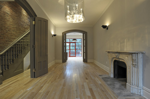
      Lighter hardwood floors 
      I know everyone was talking about dark, dark, dark floors and cabinets over the last several years, but the trend is swinging back quickly.  That doesn't mean you have to follow it.  Go with what you love.  Personally you would never get me to put dark wood in my home - too oppressive and heavy.  Whatever is in style my floors will be as light as I can get them. 


      A move back to lighter and mid tone woods especially bamboo is  trending in the new year. Bleached  and grayed woods are everywhere.  Lighter tones are so much easier to decorate around and they provide a more expansive look  in smaller homes than the darker woods of the last several years. From Veranda magazine..."When wood flooring is reclaimed or has the look of being previously used even if it wasn't, it has a softer quality that allows it to blend in as another neutral without calling too much attention to itself or instantly drawing your eye downward."

      Resurgence in gold toned accents


       Gold finishes are becoming more prevalent  in  furniture, lighting, and hardware.  They work especially well with complex grays and dark chocolate browns.

      Open walls in kitchens

      Pinterest 

      Much of what is trending in kitchen design comes to North America from European design centres.  Travelling provides a glimpse into how different our kitchens are when compared to those in Europe where lighter and sleeker looks prevail. Slab doors, no handles etc.  Be prepared for a decrease in upper cabinets and more open space, supported by larger pantry areas.

      Backsplash to the ceiling 

       Style at Home

      With the appearance of open spaces on walls above the stove or around a window, tiling goes to the  ceiling. Stainless backsplash tiles in both glossy and matte finishes are popular and will have good staying power as long as stainless appliances are around.  They work with wood and light cabinets. 

      Mixed colours in cabinets


       Cabinets in two colours are currently trendy, but be careful that you don't create problems in balance when you have high contrast colours.  Be especially careful of this look in smaller spaces where it can look very chopped up.

       Houzz

       A darker island is always an option if you want to use two colours. Visual weight can be balanced by other darks in the space.

      Reclaimed materials/eco friendly 

       Stylizimo

      The patina of reclaimed materials adds depth to a neutral scheme. Repurposing, recycling and reusing  has been a strong trend for a number of years now and will continue as an earth friendly alternative to the consumption of new materials.  In eco- friendly style only the basics are considered necessary and a  less cluttered, more zen-like environment is created.

       
       Pinterest 

       You will often see the use of simple materials  paired with more upscale objects like the zinc lamps and upholstered ottoman. You can create an interesting room by blending objects of low and high prices, textures and design elements.