Monday, April 20, 2015

Go green for spring


And continuing with thoughts of spring decorating....

When you enter my house the dining table is in full view from the entry.   In a desperation move while babysitting my 3 granddaughters, I  stuck some fake lavender in a glass jar and thought that I could get away with it.

 I was called out on that move by a family member who was a little horrified I had fake flowers.  I admit they were not good fakes.  I defensively pointed out I had beautiful fresh, pink tulips on my kitchen table, but I was caught.  Time to make amends.

Something green 


Nothing denotes spring like new growth, green and/or plants.

ferns , lantern, spring decor, centrepiece


Lately I've been seeing live plants in lanterns.  I like the look and feel, but my place is not a lantern kind of home.  I already tried the plainest one I could find, and moved it all over the downstairs rooms to no avail.  It went back to Pier 1.


glass lanterns, ferns, centrepiece, dining table

I love repetition as a design statement so it's little wonder I'm attracted to these ferns. Lanterns just won't do, but repetition is possible. 

Keeping it simple


So I decided to keep my dining table decor simple  by choosing three green things massed together in a small trough planter.  I'm talking ferns, real ones.

boston ferns, trough, centrepiece, dining table
I'
Three small  Boston ferns, and one trough planter that is very wabi sabi (lots of cracks and rough textures to play with the ferns).  I tried them in the planter before coming home with the lot.  The candles and silver leaf bird were leftovers from Christmas.  


silver leaf bird, candles, boston ferns, trough planter, dining table, centrepiece


 Tried the green candles, a no go for me.  I wish the bird was a little smaller, but that's what I have!


candlesticks, silver leaf bird, trough planter, boston ferns, centrepiece


Still playing with the arrangement.  This will go on for weeks every time I pass the table.  Some day soon I'm sure the lot will end up  corralled in a gray or white tray. Things always do on this table.


coffee table vignette, fern, copper bird planter, green tray


Remember this pic from a my friend Gail's house I featured in this post?   I envy her the copper bird planter.  A planter and a bird all in one - my idea of perfect.

Lots of options 


Now I just have to keep these greedy, moisture seeking things alive with constant watering and misting.  I can see me carting them off to my summer house  for babysitting.  I'm  sure they will see lots of moves in the coming year- ledge in bathroom, kitchen table, window ledge in kitchen, laundry room counter or shelf.  The possibilities are endless.  That's a lot of decorating punch for less than $40. 00 and they improve my air quality! 

Are plants part of your decor plan? 


Friday, April 17, 2015

Is it spring yet?

I don't know about you, but around this time of year my decor starts to look a little like I feel after a long, cold winter.  Tired and worse for wear.  I had the urge to bring some spring to my house; I tried, I really did, but mother nature had other ideas.


  I had visions  of something  like this  for my front containers with a bit of fake thrown in until the real thing is possible - that means late June here.

Source 

 I bought pussy willows and some  short, purple flowers to  add to the greenery that is there.  Unfortunately the current items from Christmas are still frozen solid.   I have  what survived the raging winds and snow of winter ....


I guess it will be red dogwood, Spanish Broom and pine for a little longer! The berries are long gone.


Then I thought what about a new wreath to hang over the containers.  I wracked my brains.  Do you know a spring motif that would look great with Christmas planters?  I  couldn't come up with one thing apart from twigs.  That wouldn't help my craving for colour.

 My only recourse was to take in my Christmas wreath in an effort to remove a little more evidence that I am not with it.


cc960 french violet Benjamin Moore


 Then I tried to convince myself that my Benjamin Moore cc960 french violet door was my spring statement!  Feeble. But hold on a moment.

Would this convince you?  "... evoking thoughts of strolling along the Seine with an armful of violet bouquets"  according to the Benjamin Moore site.  That's close, I chose it because of my memories of the lavender fields in France. My granddaughters have noticed that I love purple, at times it is a little too obvious!


 As in my latest pillow thanks to a scrap of lavender velvet left from 


this little beauty my sister made for a bench in my front porch.  Don't you just love the decorative tucks that make a pattern?  My sister is a class act when it comes to sewing and decorating.  When I got rid of the nasty red accent pillows  I thought I wanted last spring, I knew my accent would return to purple and I would have to elevate this pillow to sofa status. Bye, bye porch bench.


 If you look up you can see where the idea for purple came from.  So spring has hit my house in the form of pillows.  I admit that isn't too overwhelming.

Where does that leave me?

Still thinking about the  dining room table.  Still thinking..... Hum....


Monday, April 13, 2015

Design lesson: Giving a large look to a small dining space

Large can have a lot of meanings, but in Newfoundland large often  mean great or good or the best as in " it's a large day".   Given that understanding here's  a "large" dining room and a closer look at why it merits that rating.

small dining room, design lesson, tips
Liz Levin Interiors 

This room has a lot packed into a very small space.    Just imagine this space with a matched dining set.  It would blend into the floor and be totally blah.  How did the designer achieve this look? Perhaps there's something in her kit of tricks that you could use.


Upholstered chairs


  If you have a dining table you love, and hate the chairs, consider changing them  to coloured leather or fully upholstered ones.  It helps break up all the wood that you tend to get in dining rooms.  This approach usually means you can get away without the area rug that many people have to resort to so their set doesn't disappear into a similar wood floor.

Mixing styles

I know this isn't for everyone, but if you like a more curated rather than matched look, it's the way to go.  The days of sets are long gone.

Contrast

Nothing attracts the eye better than contrast.  It is a design fact.  If you want a more neutral space without it being boring use contrast widely.   The dark table, cream chairs, and white and brown draperies work so well together.  Reusing the cream in the centrepiece adds another contrast point.

Pattern

I'm a big believer in using pattern to add interest to a space.  The geometric pattern in these drapes
 mimics other shapes in the room, both circles and rectangles. The colour scheme is replicated in the drapes. The drapes also provide  what I like to think about as destination viewing- a spot for your eye to seek in a room and rest before moving on.  Pattern is often the bow that ties up a space.

Mirrors

A mirror goes a long way to enlarge and add interest to small places. Personally, I like a framed mirror where this one appears to be  adhered to the wall.  Don't be afraid to go large when you hang a mirror in  a dining space.  A word of caution.  Check what is reflected in it.  Perhaps it might be something you would rather not draw attention to.

 Living things

And most importantly this space has living things in it.  There is nothing like plants and flowers to add a dynamic touch to any space.

Texture

While this is a small space it is packed with subtle textures and sheens: wood, glass, pottery, weave in drapes, and plants.  Texture is the most overlooked design element in many spaces.   If your own space looks blah maybe adding some texture will help.


Fine craft

 I like the form and texture of the vases on the table.  While I don't know for sure they look like fine craft. Nothing is more boring than a room full of "accessories"  from big box stores.  There's so many unique, hand built objects in every city and town.  I contend it is more interesting to have one or two interesting objects than a house full of mass produced stuff.  You may disagree.

All of these elements work equally well  in a small space or a large space.


And here's a space to check out to see if any of the points I mentioned above are present.  It's isn't a small space, but you will see a lot of the same elements and principles applied.

Blackband Design 

Lots of points to consider and possible some you might like to play around with.  What are your strategies to create a "large" room?

Thursday, April 2, 2015

Have you tried Neybers?

 We all have our ways to relax; one of mine is experimenting with design using different design apps. Several weeks ago I found Neybers.  Have you heard of it? You can spend way too many hours perfecting a design, and there are so many designs to look at.

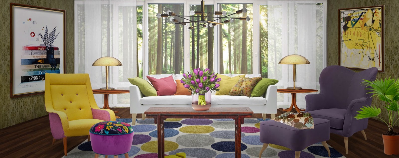
Modern magenta, Margaret Ryall using  Neybers


What is Neybers?

Neybers is an  interior design app created by amagumo games and available on ITunes.  Users  can decorate rooms with images of thousands of real products from  international interior design brands.  There is also a social component to Neybers, allowing you to follow other people, like specific designs, and make comments.  It is a fun, easy app meant for everybody.


Using Neybers

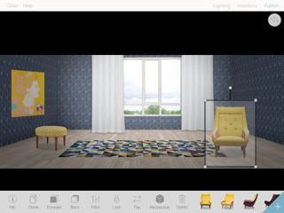
Choose a room backgrounds/template that can be decorated by clicking to select wallpaper, paint and flooring.  Windows and doors can be added, cloned for multiples, and sized. You can even choose a scene to put behind a window!  If you change your mind mid design you can go back and adjust any of the  room template options.


Once your room background is set you import images of  furniture and accessories.   These are items from real designers and brands,  many with a modernist bent that can actually be purchased.  All information regarding designer, source etc. is available for viewing. The more creative you are, the more ways for can find to use the available items in your designs.


Added items can  be move around, sized and moved forward or back in the picture plane.  There are lots of orientation choices, and I love the fact that you can change  the perspective  of many items right in the program.  Other items have various orientations you can choose from.  All items are searchable, but you can also view them by category, colour and style/genre.


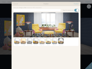
Once your dream room is created you have the option of bringing it to the next level with filters for a vintage, grayscale lighter or darker look.  Acid, bleach or vignette are also available.


You next step is publishing to the app, and if you wish, share it on Pinterest, Instagram, Facebook, Twitter or by email or IMessage.


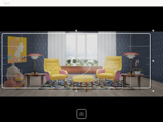
Perhaps one part of the design appeals to you more than another.  No problem. I Just move the viewfinder over the part you want and press the button.


And viola here's what I am publishing.  Only part and I've included the darken filter to make it a little more moody. 
After three weeks of using Neybers, here's my review of the positives and annoyances:


Positives:

There are many! Neybers: 
  • is easy to use, and is a great way to pass the time if you are interested in design;
  • is free to download;
  • encourages  total creativity if design is your field,  don't have to consider client budgets, likes and dislikes, etc.;
  • provides opportunities to work out space layouts, but not to scale;
  • has a social component if you  want to participate in it;
  • allows you to create and store an unlimited number of rooms with or without publishing them to the Neybers community;
  • has many options for finding objects; I particularly like the colour and genre categories;
  • allows you to see what others are creating, and many boards are strong in design and show creative use of available materials;
  • offers  easy to manipulate stock background templates;
  • presents many pieces of furniture in various orientations allowing you to place furniture in a 3D space (side orientations);
  • allows manipulation of the perspective of wall art, curtains and some furniture;
  • provides many choices in wood flooring in  room templates;
  • lets you share your designs quickly and efficiently;
  • offers new items on a continuous basis, but slowly.

Annoyances


Every app has them, and Neybers is no different.   My commentary must be tempered by the fact that I am an interior decorator and artist with a keen sense of colour and design.

This is my personal set of irritations after using the app for three weeks:

  • limited sampling of furniture and accessories if you are interested in a certain style, but lots of styles are represented;
  • being an accessory junkie, I'm always looking for new options: pillows, curtains and art items need more variety; 
  • wall treatment choices in room background templates are very limited and consist mainly of wallpaper which I would rarely choose in real life; 
  • choices for wall colours (painted look) are not subtle (mostly garish really), which usually leads me to choosing wallpaper;
  • no cropping; if it had cropping abilities it would be just awesome;
  • it is really difficult to put together a design with perfectly matched undertones mostly because of limited choice in wall finishes and accessories;
  • the terminology for categories takes a little getting use  to, and some objects are not in the obvious place;
  • there's less selection if you are interested in more traditional design;
  • some of the really desirable accessories to finish a design must be purchased from Neybers by buying coins, or won by completing tasks.

 Here are several other  colourful, modernist designs I created with Neybers.  


White on white, Margaret Ryall using Neybers


Leading with orange,  Margaret Ryall, using Neybers

Go on, if you have an IPad give it a try;  it is fun.