Monday, April 13, 2015

Design lesson: Giving a large look to a small dining space

Large can have a lot of meanings, but in Newfoundland large often  mean great or good or the best as in " it's a large day".   Given that understanding here's  a "large" dining room and a closer look at why it merits that rating.

small dining room, design lesson, tips
Liz Levin Interiors 

This room has a lot packed into a very small space.    Just imagine this space with a matched dining set.  It would blend into the floor and be totally blah.  How did the designer achieve this look? Perhaps there's something in her kit of tricks that you could use.


Upholstered chairs


  If you have a dining table you love, and hate the chairs, consider changing them  to coloured leather or fully upholstered ones.  It helps break up all the wood that you tend to get in dining rooms.  This approach usually means you can get away without the area rug that many people have to resort to so their set doesn't disappear into a similar wood floor.

Mixing styles

I know this isn't for everyone, but if you like a more curated rather than matched look, it's the way to go.  The days of sets are long gone.

Contrast

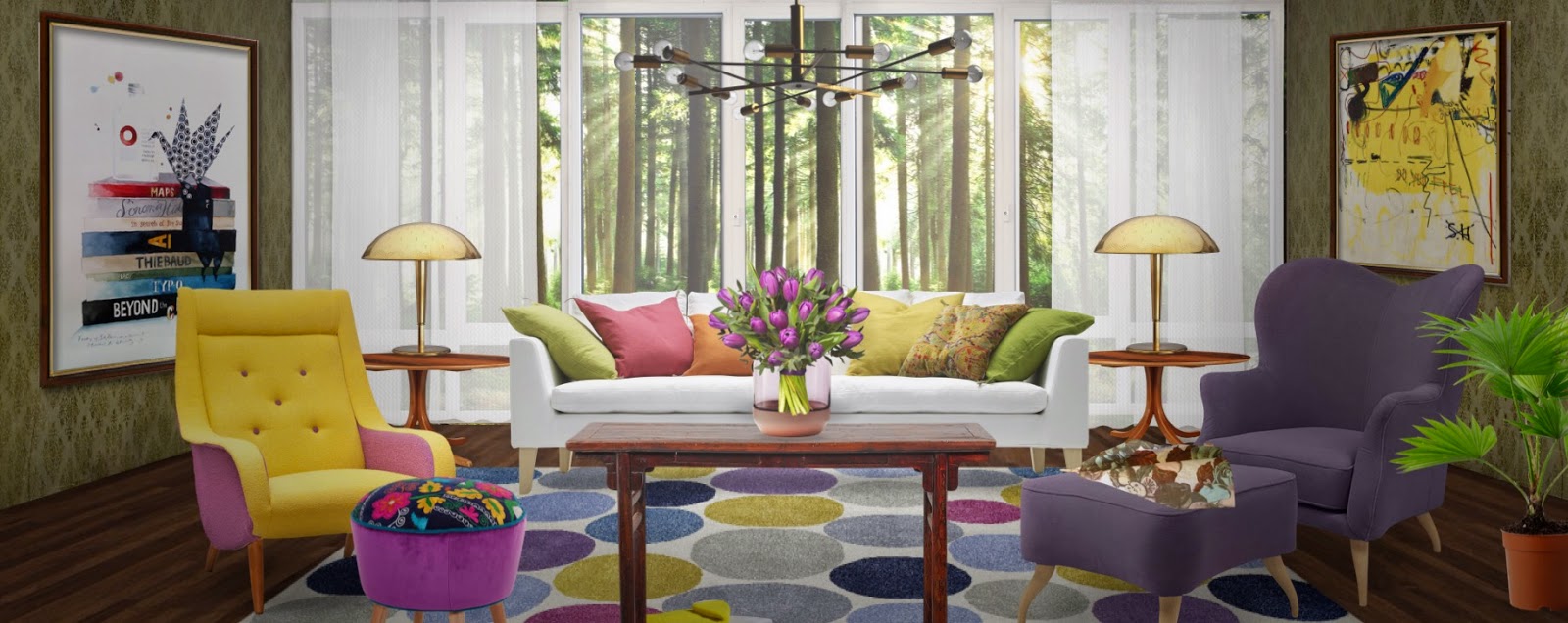
Nothing attracts the eye better than contrast.  It is a design fact.  If you want a more neutral space without it being boring use contrast widely.   The dark table, cream chairs, and white and brown draperies work so well together.  Reusing the cream in the centrepiece adds another contrast point.

Pattern

I'm a big believer in using pattern to add interest to a space.  The geometric pattern in these drapes
 mimics other shapes in the room, both circles and rectangles. The colour scheme is replicated in the drapes. The drapes also provide  what I like to think about as destination viewing- a spot for your eye to seek in a room and rest before moving on.  Pattern is often the bow that ties up a space.

Mirrors

A mirror goes a long way to enlarge and add interest to small places. Personally, I like a framed mirror where this one appears to be  adhered to the wall.  Don't be afraid to go large when you hang a mirror in  a dining space.  A word of caution.  Check what is reflected in it.  Perhaps it might be something you would rather not draw attention to.

 Living things

And most importantly this space has living things in it.  There is nothing like plants and flowers to add a dynamic touch to any space.

Texture

While this is a small space it is packed with subtle textures and sheens: wood, glass, pottery, weave in drapes, and plants.  Texture is the most overlooked design element in many spaces.   If your own space looks blah maybe adding some texture will help.


Fine craft

 I like the form and texture of the vases on the table.  While I don't know for sure they look like fine craft. Nothing is more boring than a room full of "accessories"  from big box stores.  There's so many unique, hand built objects in every city and town.  I contend it is more interesting to have one or two interesting objects than a house full of mass produced stuff.  You may disagree.

All of these elements work equally well  in a small space or a large space.


And here's a space to check out to see if any of the points I mentioned above are present.  It's isn't a small space, but you will see a lot of the same elements and principles applied.

Blackband Design 

Lots of points to consider and possible some you might like to play around with.  What are your strategies to create a "large" room?

Thursday, April 2, 2015

Have you tried Neybers?

 We all have our ways to relax; one of mine is experimenting with design using different design apps. Several weeks ago I found Neybers.  Have you heard of it? You can spend way too many hours perfecting a design, and there are so many designs to look at.

Modern magenta, Margaret Ryall using  Neybers


What is Neybers?

Neybers is an  interior design app created by amagumo games and available on ITunes.  Users  can decorate rooms with images of thousands of real products from  international interior design brands.  There is also a social component to Neybers, allowing you to follow other people, like specific designs, and make comments.  It is a fun, easy app meant for everybody.


Using Neybers

Choose a room backgrounds/template that can be decorated by clicking to select wallpaper, paint and flooring.  Windows and doors can be added, cloned for multiples, and sized. You can even choose a scene to put behind a window!  If you change your mind mid design you can go back and adjust any of the  room template options.


Once your room background is set you import images of  furniture and accessories.   These are items from real designers and brands,  many with a modernist bent that can actually be purchased.  All information regarding designer, source etc. is available for viewing. The more creative you are, the more ways for can find to use the available items in your designs.


Added items can  be move around, sized and moved forward or back in the picture plane.  There are lots of orientation choices, and I love the fact that you can change  the perspective  of many items right in the program.  Other items have various orientations you can choose from.  All items are searchable, but you can also view them by category, colour and style/genre.


Once your dream room is created you have the option of bringing it to the next level with filters for a vintage, grayscale lighter or darker look.  Acid, bleach or vignette are also available.


You next step is publishing to the app, and if you wish, share it on Pinterest, Instagram, Facebook, Twitter or by email or IMessage.


Perhaps one part of the design appeals to you more than another.  No problem. I Just move the viewfinder over the part you want and press the button.


And viola here's what I am publishing.  Only part and I've included the darken filter to make it a little more moody. 
After three weeks of using Neybers, here's my review of the positives and annoyances:


Positives:

There are many! Neybers: 
  • is easy to use, and is a great way to pass the time if you are interested in design;
  • is free to download;
  • encourages  total creativity if design is your field,  don't have to consider client budgets, likes and dislikes, etc.;
  • provides opportunities to work out space layouts, but not to scale;
  • has a social component if you  want to participate in it;
  • allows you to create and store an unlimited number of rooms with or without publishing them to the Neybers community;
  • has many options for finding objects; I particularly like the colour and genre categories;
  • allows you to see what others are creating, and many boards are strong in design and show creative use of available materials;
  • offers  easy to manipulate stock background templates;
  • presents many pieces of furniture in various orientations allowing you to place furniture in a 3D space (side orientations);
  • allows manipulation of the perspective of wall art, curtains and some furniture;
  • provides many choices in wood flooring in  room templates;
  • lets you share your designs quickly and efficiently;
  • offers new items on a continuous basis, but slowly.

Annoyances


Every app has them, and Neybers is no different.   My commentary must be tempered by the fact that I am an interior decorator and artist with a keen sense of colour and design.

This is my personal set of irritations after using the app for three weeks:

  • limited sampling of furniture and accessories if you are interested in a certain style, but lots of styles are represented;
  • being an accessory junkie, I'm always looking for new options: pillows, curtains and art items need more variety; 
  • wall treatment choices in room background templates are very limited and consist mainly of wallpaper which I would rarely choose in real life; 
  • choices for wall colours (painted look) are not subtle (mostly garish really), which usually leads me to choosing wallpaper;
  • no cropping; if it had cropping abilities it would be just awesome;
  • it is really difficult to put together a design with perfectly matched undertones mostly because of limited choice in wall finishes and accessories;
  • the terminology for categories takes a little getting use  to, and some objects are not in the obvious place;
  • there's less selection if you are interested in more traditional design;
  • some of the really desirable accessories to finish a design must be purchased from Neybers by buying coins, or won by completing tasks.

 Here are several other  colourful, modernist designs I created with Neybers.  


White on white, Margaret Ryall using Neybers


Leading with orange,  Margaret Ryall, using Neybers

Go on, if you have an IPad give it a try;  it is fun.

Monday, March 30, 2015

Using mirrors to solve decorating problems

Sometimes I have to remind myself of the power of mirrors to solve common decorating problems.   Here are seven  fantastic uses of mirrors that might not be on your radar.

1. To reflect light


mirrors, living room, reflecting light


This is one great space for a number of reasons, but the mirrors make it in my opinion.  Not only do they break up a dark wall and provide height to match the window, they reflect light in what might otherwise be a blah room.

2. To create a window in a windowless room 


mirrors, windowless room, living room mirror


dining room mirrors, windowless dining room, 3 large mirrors

There are often sections of a space that are dark and windowless.  Mirrors can give the illusion of a window and light without having to make architectural changes.  In both rooms above the mirrors also add dramatic focal points.


3. Add drama to an open space


foyer mirror, large foyer mirror, lucite table and mirror

This high ceilinged space demands a large scale treatment.  This mirror fills the bill when it comes to matching the scale of the space.  The choice of a lucite table ensures that the lines of the mirror remain dominant.


4. To replace art


mirror over bed, mirror focal point


 Sometimes a mirror when used well can replace art over a bed or mantle.  In this space the sculptural light is reflected in the mirror,  providing an interesting visual focus.


5. To highlight art/collections


mirror behind art collection, three mirrors living room


6. To create impact 

repetition of arched mirrors, mirrors living room, mirrors impact

 One of the best ways to create impact is through repetition.  Imagine the scene above if you just has three or four mirrors.


7. To balance large windows 


mirror with large window, large mirror living room

I love how the mirror is large scale, soft with its rounded top, and the height relates well to the window.  The gold relates to the lamps and the table which also mimics the rounded top of the mirror.


large mirror fireplace

I am definitely interested in any solution that helps balance heights/scale  in a room.  One of the best things about this mirror treatment is how it relates to the window next to it and the furniture in the space.   You read the fireplace and mirrors as one unit. The fireplace alone is small and delicate.  Keeping the mirror frame lighter and gold helps it to relate to the other furnishings in the space.

Seven reasons why you should have a mirror in your home apart from the obvious.  Who knew? Are you a mirror lover?  I'm sad to say my mirror choices are purely functional.  What about yours?

Please find links to photos on my Pinterest board Mirrors.

Saturday, March 21, 2015

Lighting your dining table

The right lighting can make a room sing, but often our rooms are  off key. When you have a house of a certain age (30 years for me) there comes a time when you know you have  to update your look. When I started to change the lighting in my home, I began with the two over my tables because they would have the most impact.

dining table, lighting, drum pendant, contemporary,Designing Home, Margaret Ryall
Kitchen table 

When you're buying lighting to hang over a table you should consider these  factors:


 Height of ceiling

A taller ceiling  often requires  larger fixtures; many new home builds in my area now have 9 foot ceilings.

Size and shape of table

Your fixture should complement not overpower your table.  You can also have lighting fixtures that are too small for a table.  I am particular about  what shape fixture I mount over a round table; I like to repeat the shape with a circular format, but that's just me.

Height of homeowners

It is a fact that tall homeowners have a greater chance of continually bumping into lights hung too low over a table when they are setting or removing dishes.  Some people are so tall your would never mount pendants high enough!


Height above table

The specifics of how high to hang your fixture can be confusing because you will find a range of suggestions depending on which sites you consult.  Don't let that deter you.  My adage is "Common sense prevails".

 I tend to think in terms of a range while taking other factors into account including: personal preference, the height of the homeowners, fixture size, style of fixture, ceiling height, task to be illuminated etc.  Read on for examples.


    graphic lighting your dining table


    The general recommendations for  hanging a fixture over a table is 28 - 32 inches above the table if you have an eight foot ceiling.  This graphic from wegotlites recommends 30 inches from the table for an 8 foot ceiling.   I placed my kitchen table pendant  at 32 inches from the table top so I wouldn't continually bump it when working. It works most times, but when I reach in too far I still bump it.


    dining room pendant, hanging height,


    My dining room pendant is 34 inches from the table.   Being able to view my art collection to best advantage in very important to me, so  I moved the  dining room pendant up an additional two inches from the hanging height in the kitchen  so visitors can  view the art over the buffet without disruption while sitting in the living room.  You may not find this consideration in any lighting guide!

    Another set of guidelines recommend measuring  from the floor  to the bottom of the shade and suggest 60 - 66 inches as reasonable.  Most tables are 30 inches high.  That would put the height from the floor  to my kitchen  shade at 62 inches, and my dining shade at 64 inches, both are within this guideline.

    If you have ceilings higher than eight feet, go up 3 inches for each additional foot above eight feet.

     Size of fixture

     For most applications the diameter of your light fixture should be at least 1/2 the width of your table or even up to 2/3 the width of your table.   My kitchen fixture is exactly one half the width of the table at 18 inches in diameter.  That's the proportion I like.  I could have gone with a diameter of up to 24 in. without it looking too large.  My dining fixture is only 16 inches  in diameter, but looks larger.

    Sizing based on room dimensions

    graphic lighting your dining table, Designing Home, Margaret Ryall


    There is another guideline for determining the size of your fixture. Add the length and width of your room together ( eg., 11 feet +14 feet ) and convert the sum to inches (25in.) and that should be the diameter of your  fixture.

     Of course that is not a hard and fast rule, but it will provide a light fixture that is a focal point for the room.  This formula works better for a statement fixture  in an entrance or stairway.  You can see how it could get out of control in a dining room.  Eg. 15 feet + 20 feet would give a fixture diameter  of 35 in.  That's the width of most dining tables. 

    Function of fixtures

    The illumination given off by drum shades  is soft and calming,  but  bright enough to provide lighting for an entire room.  When a large drum pendant is hung over a table it not only anchors the vignette, but if placed on a dimmer the fixture can provide brighter light for any tasks done at the table and softer light while dining. While I don't have anything against chandeliers, I don't have any in my own home.I'm definitely into clean lines and a very sparse contemporary feel.


    I am planning another post about lighting selection for various rooms as I get ready to replace the fixtures in my summer house.   Stay tuned.  

    What variables do you consider when hanging a light over a dining table?

    Monday, March 2, 2015

    Adding greenery to contemporary decor

    After a dreary northern winter I begin to long for a spot of green in my decor.   I've even given my blog a new green look.

     Last spring I wrote about my lucky bamboo,  my default plant that resulted from an aborted shamrock search.  Poles apart, I know!  Choice is often limited when you live on an island; you can convince yourself it's what you wanted all along.

     I've been enjoying my bamboo and it seems to love my house.

     I went to look for one for a friend for Christmas.  None to be had, but I could find a shamrock.  Go figure.


    What a difference a year makes. 

    There's nothing like a plant or a grouping of flowering branches to bring a space to life.  Even the most neutral colour schemes sing when there's a little green around.


    Can you have too many plants?  Yes, in my opinion.  You don't want a jungle. One or two plants  get noticed and more than that becomes a bit of a mess.  You may disagree.